Akamai Media LLC Web Performance Report

A clear look at
Jet Li's website.

A plain-English review of how jetli.com is working today: what a first-time visitor sees, how easily fans and new audiences find you, and where a few focused changes would make the biggest difference.

Prepared for
Jet Li
Website
jetli.com
Site captured
July 15, 2026
Prepared by
Mark Moran
0/100
Opportunity

Overall website health

The site looks the part. It is elegant, cinematic, and fast, and it carries the Jet Li name with real polish. What is thin is the substance underneath: the homepage says very little, search engines and AI have almost nothing to read, and a few small glitches (a sentence that cuts off, an oversized repeating banner, a brand domain that forwards away) undercut an otherwise premium feel. These are refinements on a strong foundation, not a rebuild.

Strong Opportunity Needs attention
Watch first

A quick walkthrough of your report

Your nine-point scorecard

Every Akamai web performance report looks at the same nine areas: the things that decide whether a website earns trust, gets found, and turns visitors into fans and readers. Each area is scored out of 100, and together they average to the overall score above. Click any card to read the full explanation of that area.

Does the site look current, premium, and unmistakably yours? For a global name like Jet Li, the site has to carry that stature the moment it loads, and for the most part this one does.

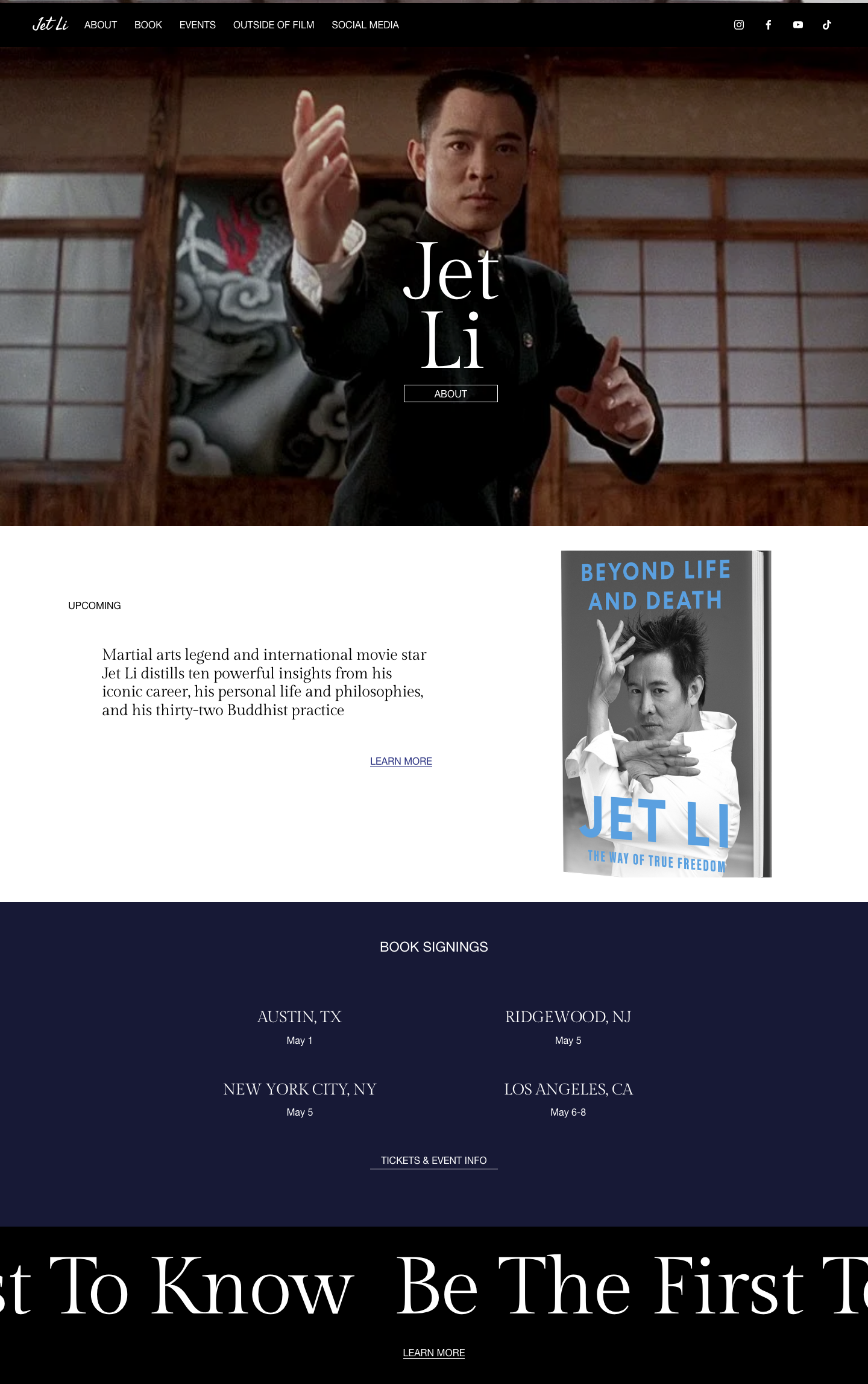
The jetli.com homepage today: a full-screen cinematic hero photo of Jet Li, a book promotion, and an events section
jetli.com homepage, captured July 15, 2026.
What a first-time visitor sees
Striking, cinematic hero with elegant typography sets a premium tone
1
The book blurb cuts off mid-sentence: "his thirty-two Buddhist practice"
2
An oversized "Be The First To Know" banner repeats across the lower page and overwhelms it
3
Little about Jet Li himself on the homepage beyond the book and the events
Working

The look is premium and on-brand

The full-screen hero, the restrained serif typography, and the dark cinematic palette all read as considered and high-end. This is the hardest part to get right, and the site already has it.

Gap

The book description ends mid-sentence

The homepage promo reads "...his personal life and philosophies, and his thirty-two Buddhist practice". A word appears to be missing (likely "years of"), and because it sits in the main feature block, it is one of the first things a visitor reads.

Gap

The "Be The First To Know" banner is too loud

Near the bottom, an enormous "Be The First To Know" headline repeats and scrolls, dominating the page. It reads as a template placeholder more than a deliberate design choice and pulls attention away from the book and events above it.

Gap

The homepage is more poster than page

It is beautiful, but it functions as a splash screen. A first-time visitor learns that there is a book and some events, and very little else about the person, the films, or the philosophy the site gestures at.

Why this matters for your audience

The design is a real asset, so this is about protecting it. Fixing the cut-off sentence and calming the repeating banner takes minutes and removes the two small things that make a premium site feel slightly unfinished.

When someone searches for Jet Li, his book, or his appearances, does this site show up with something useful? The name will always rank, but the page gives Google very little to work with beyond it.

How much content Google has to work with
This homepage
87 words
Pages that rank well
~700 words
A visually rich page can still be nearly invisible to search if there is little real text to read.
Canonical link Mobile friendly Descriptive page title Meta description Section headings Image alt text
Gap

The page title is just "Jet Li"

The browser and search title reads Jet Li with nothing else. A title like "Jet Li - Official Site, Book & Appearances" would tell search engines and searchers what the page actually offers, which matters for every search that is not simply his name.

Gap

There is no meta description

The homepage has no meta description, so Google writes its own snippet from whatever scraps of text it finds. On a page this sparse, that snippet is often unhelpful, which lowers the click rate even when the site does appear.

Gap

Very little text, and a duplicated headline

The homepage has roughly 87 words. It also carries two top-level headlines, one of which is the repeated "Be The First To Know" banner, and then jumps straight to small subheadings. That thin, jumbled structure gives search engines almost nothing to index.

Why this matters for your audience

The Jet Li name guarantees the top result for his name, so the missed opportunity is everything else: the book, the events, the films, the philosophy. A descriptive title, a real description, and a few paragraphs of genuine content would let the site capture searches it is currently invisible for.

When someone asks ChatGPT or Google's AI about Jet Li, his book, or his tour dates, can it find and quote this site? The plumbing exists, but there is almost nothing for an assistant to actually say.

What an AI assistant can pull from this site
Can read today
  • Structured data exists (schema.org)
  • The site name and basic identity
Can't find — so won't recommend
  • A real bio or career summary
  • Book details in a readable form
  • Event dates and cities as data
  • Any FAQ or quotable substance
Working

The technical foundation is already there

The site outputs structured data (schema.org markup, including a WebSite and a business entity). Many sites have none, so the scaffolding an AI assistant looks for already exists here.

Gap

The structured data does not describe the real content

The markup is generic and even labels the site as a "LocalBusiness", which does not fit. There is no Book entity for "Beyond Life and Death", no Event entities for the signings, and no Person profile for Jet Li, which are exactly the things an assistant would want to cite.

Gap

There is almost nothing to quote

With under 90 words and no bio or FAQ, an assistant asked "what is Jet Li's new book about?" or "where is his next appearance?" has little to pull from this page, even though the site is the authoritative source.

Why this matters for your audience

More people now ask an assistant instead of scrolling search results, and those tools favor sites with clear, structured, detailed information. Because the foundation is already here, adding proper Book, Event, and Person data is a genuine edge that would let the site be the source the AI quotes.

Is it clear what this site is for and why someone should stay? A visitor decides in seconds, and right now the page is beautiful but says almost nothing.

What a first-time visitor can learn on the homepage
2 of 6covered
There is a new book
There are upcoming events
Who Jet Li is (a real intro)
What the book is actually about
His films or career
Why to join the mailing list
Working

The essentials are pointed to

The two things the site clearly wants to promote, the book and the book-signing events, are both present and easy to spot. The intent of the page comes through.

Gap

The homepage barely introduces Jet Li

Beyond a one-line book blurb (which is itself cut off), there is no real introduction, no career summary, and no story. For most visitors who are not already deep fans, the page assumes a lot and explains little.

Gap

The calls to action are vague

The main button simply says "About", and the largest element on the lower page is a "Be The First To Know" banner with no reason attached. Telling visitors what they will get (early access, tour news, a chapter preview) would turn a pretty page into an effective one.

Why this matters for your audience

People engage when a page answers their questions before they have to ask. A few genuine sentences about Jet Li, the book, and why the mailing list is worth joining would let the site convert the attention its design already earns.
Can a visitor easily do the things the site wants them to do: learn about the book, find an event, or sign up? The routes are there; they just are not pointed to clearly enough.

The things a visitor might do, and how clear each path is
Land
Arrives on a striking hero
Book
Finds the book & a Learn More link
Events
Sees the signing cities and dates
Sign up
Mailing list is loud but reason-free
Working

The key actions are all present

A visitor can reach the book, see the four book-signing cities with dates, find a tickets link, and join a mailing list, all from the homepage. The building blocks of conversion are here.

Gap

The first call to action is unclear

The single button under the hero reads "About", which is a weak first ask for a site that mainly wants to sell a book and fill events. A clearer primary action ("Get the book" or "See tour dates") would guide more visitors toward what matters.

Gap

The mailing list asks without offering

The oversized "Be The First To Know" banner is the biggest prompt on the page but gives no reason to sign up. A short promise (early access, tour announcements, a preview) would lift sign-ups noticeably.

Why this matters for your audience

The site already has the traffic a famous name attracts, so small clarity improvements convert directly into book sales, ticket clicks, and subscribers. Naming each action and giving the mailing list a reason are quick wins with real payoff.

Does the site feel legitimate and current the moment a visitor arrives? For a public figure, the site is the authoritative source, so it needs to look unmistakably official.

Trust signals a first-time visitor scans for
Secure connection
Clearly the official site
Real social links present
jetli.com forwards to jetli.world
No footer, dates, or credits
Working

It reads as the genuine, official site

The connection is secure (HTTPS), the design is high quality, and links to the official Instagram, Facebook, YouTube, and TikTok are all present, which together signal a real, maintained presence.

Gap

The brand domain forwards away

Typing jetli.com lands the visitor on jetli.world. It works, but the most memorable, valuable domain simply redirects, which can quietly split search authority and momentarily confuse a visitor who expected the .com.

Gap

There is no footer or credibility anchor

The page has no footer with a copyright, a contact, or a clear "official site" statement. Small print like this is a quiet but real trust signal, especially for a name that attracts fan sites and imitators.

Why this matters for your audience

For a public figure, trust is mostly about looking unmistakably official and current. Pointing the .com to the real site directly, and adding a simple footer, closes the small gaps between a site that looks official and one that is provably so.

Can everyone actually use the site, including visitors relying on a screen reader or keyboard? This is an area where the site is already in good shape.

Automated accessibility scan
Clean
1 to tidy
AAAAAA
Web accessibility grade
"AA" is the grade the law effectively expects a business website to meet, and this site essentially meets it. The automated scan flagged no serious problems, only a single moderate item: the heading order skips a level. Tidying that leaves a genuinely accessible site.
Working

No serious accessibility problems

An automated scan found zero serious issues, which is uncommon and a real credit to the underlying template. Keyboard navigation and color contrast hold up well.

Gap

One heading-order slip

The one item worth fixing is a skipped heading level (the page jumps from its main headline straight to small subheadings). Screen-reader users navigate by headings, so a clean top-to-bottom order makes the page easier to move through.

Gap

Two images have no description

The hero and book images have no alt text. Adding a short description ("Jet Li in a martial arts stance", "Beyond Life and Death book cover") helps screen-reader users and search engines both.

Why this matters for your audience

The site is already close to a spotless accessibility grade, which lowers both a real barrier for disabled visitors and a real legal risk. The two small fixes here are quick, and they push a good result to an excellent one.

Does it look and work right on a phone, where most people will first meet it? This is one of the site's clear strengths.

On a phone
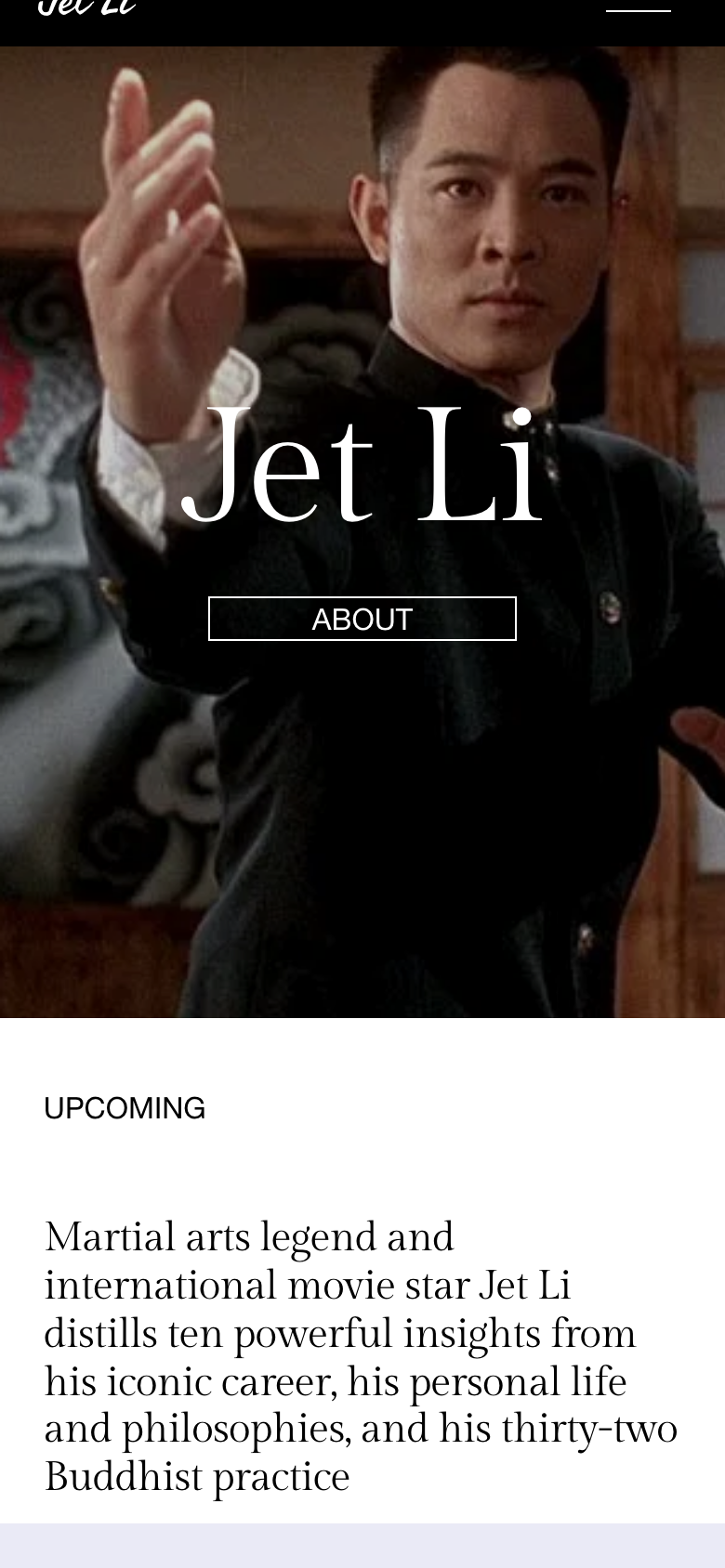
The jetli.com homepage on a phone: the full-screen hero photo and title adapt cleanly to the small screen
jetli.com on a phone-sized screen, captured July 15, 2026.
Adapts cleanly with a proper viewport and no sideways scrolling
The hero holds up, with the title and button well placed on a small screen
1
The oversized banner is even more overwhelming at phone size
Working

It is genuinely well built for mobile

The hero, the type, and the layout all scale down gracefully. Nothing overflows, tap targets are comfortable, and the premium feel survives the shrink to a phone screen, which is where most visitors will arrive.

Gap

The repeating banner is worse on mobile

The same "Be The First To Know" banner that overwhelms the desktop page takes up even more of a phone screen. Calming it on desktop fixes it on mobile at the same time.

Why this matters for your audience

Mobile is already a strength, so this is about polish rather than repair. The site feels considered on a phone rather than merely shrunk to fit, and taming the one loud element is the last mile.

Does it load fast enough to keep people from leaving before it appears? It does today, though it is heavier than a page this simple needs to be.

68/100
Opportunity
~0.6sFirst content appears
~0.9sFully loaded
951KBJavaScript the page loads
Working

It appears quickly

First content shows in about 0.6 seconds and the page finishes loading in under a second on a good connection. Visitors are not left staring at a blank screen.

Gap

It carries a lot of code

The page loads roughly 951KB of JavaScript plus its images, for about 1.5MB total, on what is essentially a one-screen splash. Much of that is platform overhead that goes unused, and it is the main thing weighing the page down.

Gap

Speed will suffer as content grows

Today the page is light on content, so the heavy scripts do not hurt much. As the real bio, book, and event content this report recommends gets added, that overhead becomes a bigger drag unless it is trimmed.

Why this matters for your audience

Speed is fine now, but the page is carrying weight it does not need. Trimming unused scripts and right-sizing the images keeps it fast as the site grows into the fuller, richer content the other sections call for.

If you do three things

The highest-impact fixes first

You do not have to tackle everything at once. Ranked by impact for effort, here is where I would start.

1

Fix the cut-off book sentence and calm the repeating banner

A few minutes of copy and layout cleanup removes the two small glitches that make an otherwise premium site feel unfinished. Highest impact for the least effort.

Effort: minimal · Impact: high
2

Give the homepage real content and a proper title and description

Add a genuine introduction to Jet Li, a real description of the book, and a descriptive page title and meta description. This is what lets the site get found for everything beyond his name and turns visitors into readers and subscribers.

Effort: moderate · Impact: high
3

Add proper Book, Event, and Person structured data

Replace the generic markup with real data for the book, the signing events, and Jet Li himself so that Google and AI assistants can find, understand, and recommend the site with confidence.

Effort: moderate · Impact: growing fast

Want to talk through the findings?

This report walks through all nine areas of the site's performance, with the highest-impact opportunities called out. Given our long history working together, I would be glad to talk through what would make the biggest difference for jetli.com, and where I would start.

Prepared by Mark Moran · Akamai Media LLC · akamai.media